Logo design trends change every year, and that’s a usual process. Branding design is no exception. Against the backdrop of growing competition, you need to constantly update your style and attract attention. What will be relevant in 2022: strict minimalism or bright experiments? Experts from Logaster analyzed 10 logo trends that could affect business identity in the next year.
Table of Contents
Logo Trends for Design in 2022
-
90’s Stylistic
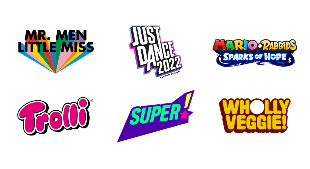
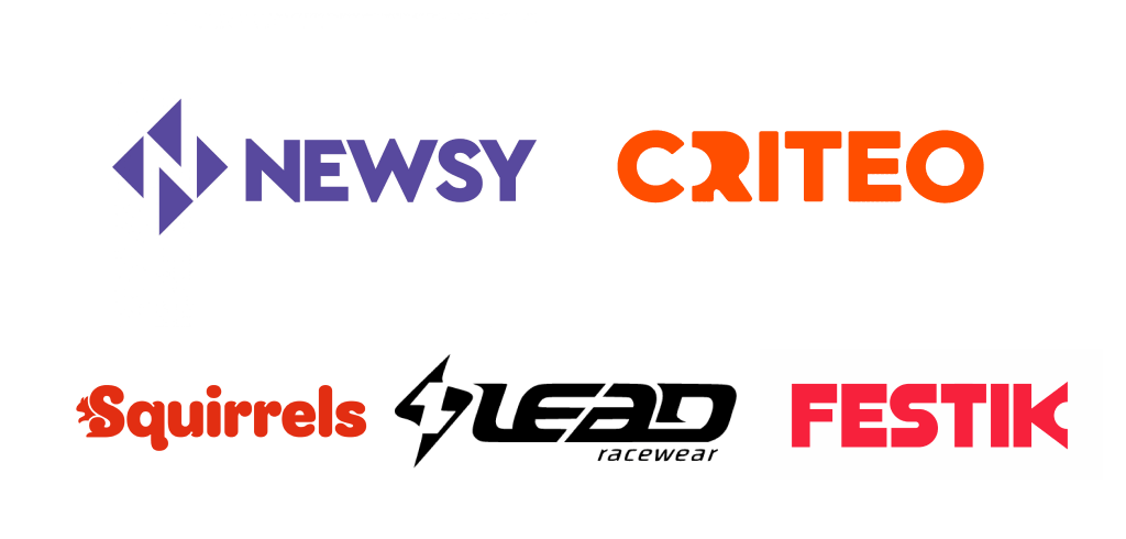
Many readers will smile nostalgically when they see this special, recognizable style of the end of the last century. It is reasonable to believe that it will become relevant again. In 2022, 90’s logos are expected to inspire contemporary designers.
The most interesting elements will be taken into account: in particular, the use of overly bright and, at first glance, incongruous shades. Letters drawn as if by hand will also look interesting. An excellent solution to stand out against the background of the now fashionable minimalistic identity.
-
Negative space
This design technique can hardly be called the “discovery of the year”: experts have used it for a long time. However, it is still relevant: perhaps, this is one of the most stable trends in identity design. To implement negative space, you can use the effects of intersection, ambiguity, and removal of individual elements (for example, parts of letters).
The most interesting thing is that any of these changes are not immediately noticeable. A person needs to look closely to notice the peculiarities of the style. This is how negative space attracts attention. People love visual puzzles, including encrypted messages on canvas. When a person unravels the “secret” of the logo, they will remember it well and, perhaps, feel a special connection with the brand.
At a basic level, negative space can emphasize the limits of positive space. In addition, it increases brand awareness and contributes to the growth of the logo’s popularity.
-
Fonts: non-standard solutions
Fonts have played a major role in graphic design over the past few years. Many brands have focused specifically on text logos. Considering the limited set of standard fonts, designers began to change the usual visual solutions to achieve uniqueness. After all, it is almost impossible to make a text brand name recognizable in any other way.
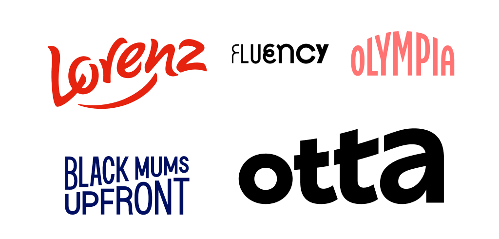
The examples show the most common options for changes: letter alignment, replacement. Any interesting solutions will increase the visibility of the logo. The audience may like the out-of-the-box approach.
- Extra resource: dive deeper into 10 characteristics of fonts and their use in design!
-
Layering
The essence of this trend is the development of layered images to achieve depth and volume effects. The abundance of layering options allows you to create a unique and memorable image with a high degree of probability.
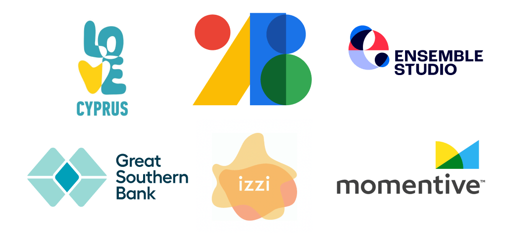
Layering is implemented using different methods. For example, they combine logo elements, create a copy of one of them, apply colors, and use geometric shapes. There are many possibilities: you cannot list everything in one sentence.
-
Bright colors
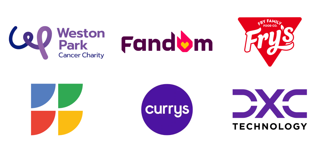
How to make sure your logo is memorable? Use rich, vibrant colors and experiment with their combinations. This solution is especially recommended for brands that want to completely renew their corporate identity.
The year 2022 is expected to open up opportunities for bold color experiments. You can temporarily “forget” about the tables of color combinations and become a bit of “Mad Hatter”. Why is that? Because the bold color scheme instantly grabs the audience’s attention. This is important, since the problem of reducing the average time of user interaction with brands is urgent nowadays.
- Extra resource: follow these 10 tips on how to choose a color for your logo and get great visuals right away!
-
Minimalism
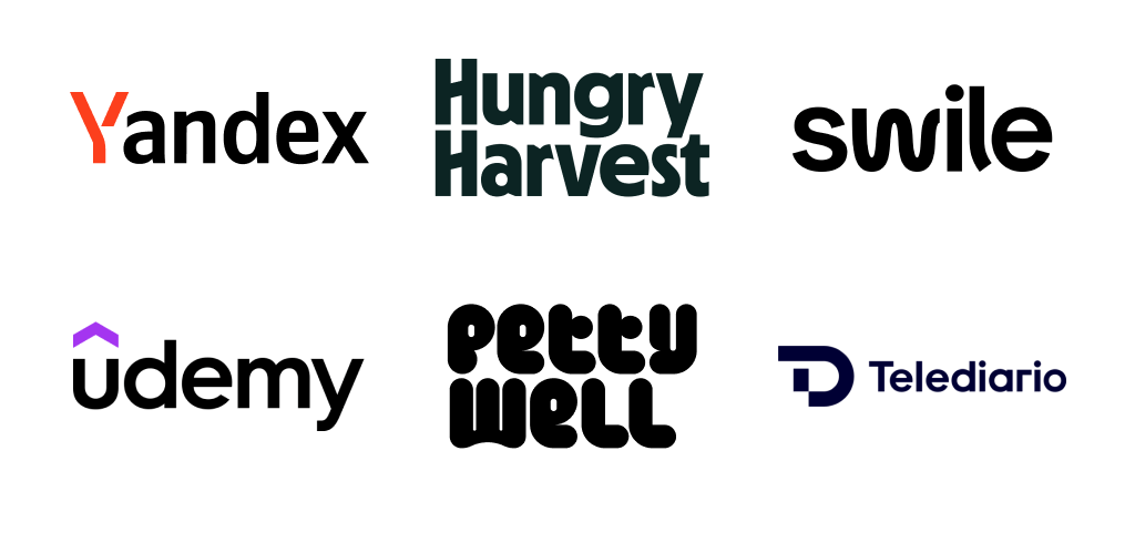
The laconic design with simple lines and the absence of unnecessary details “fired” several years ago and is still relevant. This is mainly due to the digitalization of the business. The fact is that the logo, designed in the style of minimalism, looks good and is easily recognizable in any size: be it a tiny icon in a messenger or an avatar on a social network. In general, “if you want to be universal, keep it simple.”
- Extra resource: how about these 20 free minimalistic fonts? They will surely bring sophistication to your logo design projects.
-
Geometric shapes
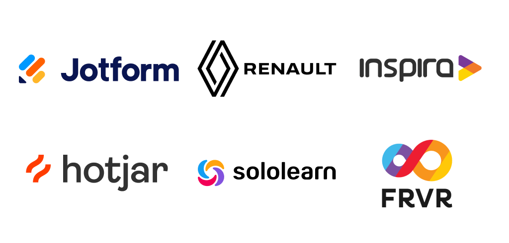
This trend is loved by designers, as it gives freedom of creativity. The use of geometric signs is a good option for a small update of the standard logo. You can preserve the recognizable logo and make it a little different by adding one or more geometric elements and making an accent – for example, using a separate color.
-
Games with symbols
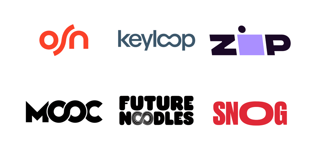
Designers have long used symbols to create a brand identity. Surprisingly, this trend continues and even becomes more popular over time. Experiments with symbols in 2022 will also be relevant. It is possible that this trend will become a part of the key ones in logo design.
So, with the help of symbols, you can visually emphasize the advantages of a company or product. You can also create accents that will “catch” the eyes of potential customers and stimulate them to consider the logo in more detail.
-
Gradient
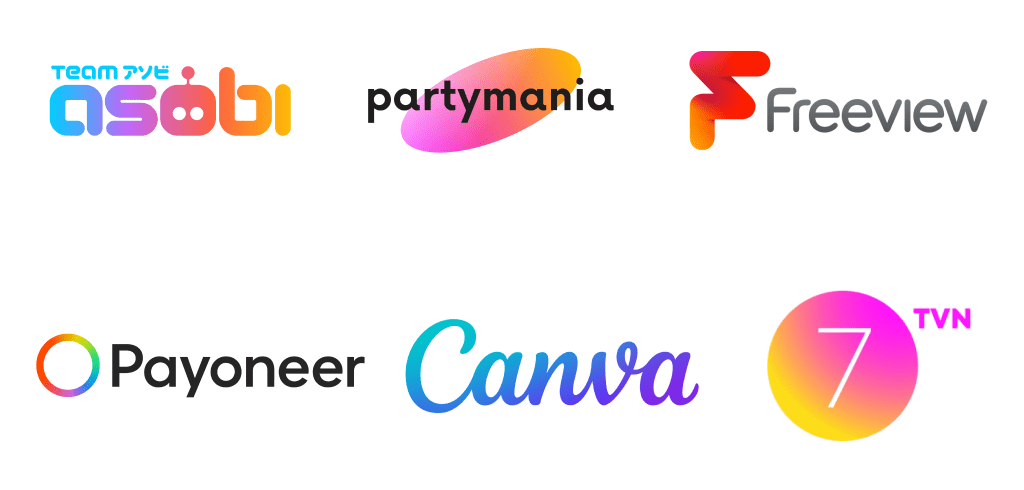
Gradients in branding have been a popular trend for several years now. There is an explanation for this. Design software is constantly evolving, and there are many ways for today’s professionals to work with shades. Therefore, it is now possible to create great color transitions.
If the direction is already in demand, how can it surprise you in 2022? It is expected that designers will expand the color gamut and use different methods of applying the gradient. Specialists will more often use methods of decreasing or increasing the saturation of the selected hue, switching between colors.
The gradient makes it possible to create an original visual solution, increase the uniqueness of the logo, or simply successfully update it. Moreover, the branding can become more voluminous. Well-chosen colors will form a special perception of the identity.
- Extra resource: choose from popular gradient color palettes for your next design project!
-
Optic illusion
The natural desire of any brand is to be remembered by its target audience. To achieve this, some companies are moving away from standard solutions and choosing new methods. One of them is the use of optical illusions. There are several examples and solutions available in the image:
- negative space (which was mentioned above);
- unique, previously non-existent figures;
- color illusions;
- visual distortion;
- illusions created by the contrast method.
This method makes it possible to create visual solutions “with a secret”. The viewer is interested to know what the logo hides behind it. This increases the average time of contact with the symbols – and, consequently, improves memorability.
Conclusion
Most of the trends in logo design are well known to trend experts from yesteryear. What will a modern design be based on? It will be based on creating unique solutions and increasing visibility. To stand out from the competition, professionals will use unusual colors, shapes, and other presentation formats. Modern development tools provide all the possibilities for this.
Extra resources
- Check out all the key aspects of good logo design and start working on new logos today!
- See how the team managed to redesign their brand identity with the new Depositphotos logo. It’s never too late to change for the better! Explore the case study to highlight all possible changes for your own brand.
- Learn more about visual identity to enhance your brand based on the analysis of well-known brands that need no introduction – Apple, Coca-Cola and others.
- Find out what other types of visuals every ecommerce brand needs besides a well-designed logo.
- By the way, we’ve already covered creating a logo that can sell your style of photography in your portfolio. Check it out if you are an aspiring photographer and just starting your business as a photographer.
