Why Is a Book Cover Your #1 Marketing Tool?
A cover does a couple valuable things for your book:- A cover sets reader expectation: If you spend time or money on a good cover, readers can assume that you’ve also spent time and money on a good editor. In other words, a professional book cover speaks to the professionalism of the book’s interior. More than that, a cover sets the tone for your book and conveys the genre so readers know what to expect when they start reading.
- A great cover helps your book stand out from the crowd: Did you know that in 2020, there were over 44,000 writers and authors in the US, and in 2018, over 1.6 million books were self-published in the US? These numbers demonstrate an increasing trend. And that’s only sbooks publishewd via self-publishing platforms, never mind traditionally published books. Statista reports that nearly 100,000 books were published in 2019 by only four of the leading book publishers in the US. That being said, book sales are also growing, so don’t lose hope; in fact, sales of consumer books in the US were up 19.1% in February 2021, at $646 million. Book printing is still going strong, and books will always be in demand!
- An attractive cover can be successfully used in marketing campaigns: Here are a few ways you can use your cover effectively to market your book.
- Reader surveys: ask your readers on social media which version of your cover looks better. This is a great way to not only get feedback, but also generate hype about your book before the release date.
- Cover reveal: Blog about the final cover on your website and send it out to your newsletter. Be excited about your final cover and your readers will be excited too!
- Social Media: Use your cover on social media posts to talk about your recently published book, or about a limited-time discount for a book that has been out for longer. You can also try out ads on social media to gain a wider reach. This is a great way to reach readers who may not visit your site or be subscribed to your newsletter. Be sure to also make your posts public and shareable, so readers can do the legwork for you and spread the word .
- Book Giveaway: This could be a giveaway of your physical book or ebook, and may include other prizes as well, such as a T-shirt, mug, or even a Kindle. You can also team up with other authors to offer multiple books in the giveaway. A giveaway can either have one winner, or you can allow everyone to download free ebooks, while only one person wins a physical prize, if there is one. There are many sites that will allow you to host a book giveaway, including Goodreads (print or ebook), Book Cave (ebook), and Readerviews. You can also run the giveaway yourself, through your own website or a social media platform. Wherever you host your giveaway, your attractive cover will lead readers to enter.
- UGC on Social Media: UGC stands for user generated content, and it’s a great way to get more content on social media, spread the word, and build trust in your brand. To take advantage of this, you could ask your social media followers to post a picture of themselves with your recent print or ebook, with the cover prominently displayed. Bonus points if they’re doing something fun in the picture, like swinging, sitting on a Ferris wheel, and so on. You could even say that you’ll choose a few to post on your website.
- Competitions: Competitions can be done in tandem with the previous two ideas (like winning a physical prize in a giveaway, or readers having their picture chosen and perhaps winning an additional prize with UGC), but there are also a few additional ways you can use competitions to market your book. You could run a competition (Rafflecopter is very popular to use) where readers can get entries when they share your book, subscribe to your newsletter, or follow you on social media. The prize could be an ereader, a gift card, a phone call with the author, a set of your other books, a box set with the book you’re promoting, or a swag pack (which could contain a signed copy of your book, bookmarks, a poster, a pin, and other items specifically related to your book).
- Promotion Sites: There are many promotion sites that will tell their subscriber list about your book—usually they require that you discount it for a promotion. High-quality promotion sites only accept books with genre-appropriate, eye-catching covers. While many promotion tactics on this list are for newly released books, temporarily discounting your book and using promotion sites to get the word out is one of the best ways to generate sales of your backlist books.
- Promotional Material: You can use your cover on promotional material like mugs, bags, magnets, and bookmarks, even if it is just a piece of the cover (like the subject or the background). This is a great way to spread the word about your book, get others to market for you when they buy and use the products, and make a little bit of extra money on the side. Note that if your cover uses stock images, you must get an Extended License for any stock image you use on merchandise like this.
But What Makes a Good Cover?
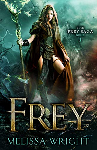
Of course, it’s one thing to know that a good cover is important, but what makes a good cover? Here are 4 tips on what makes a good cover:- The image must be eye-catching and relevant to the genre.

Source: mybookcave.com
This next one shows a regular item over a background. This background works well because it is textured and has dimension to it, rather than being a flat, colored box. The modern suitcase likely belongs to a woman; it (and the title) suggests travel, and there are no romantic elements on the cover. Can you guess what genre this one is?
Source: mybookcave.com
It’s women’s fiction—did you get it right? Like the first cover example, this next one uses two different images for the cover. The darkened, eerie scene with the silhouetted woman speaks to the book being a thriller or mystery.
Source: mybookcave.com
2. Font and text placement should match the feel of the image. For example, this next cover is dystopian, and dystopian books often use bold, capitalized letters that appear cracked or worn. On this cover, the symmetry of the image makes centering the font the best placement for it. (While most covers do have titles placed in the center, the text within the title may be offset to create more interest—we’ll talk more about this later.)
Source: mybookcave.com
In this last image, the color for the text was pulled from the image itself. This is a great way to link your cover image and text. On the other hand, the cover that we looked at previously doesn’t have much color to pull from in the image, so the designer chose a contrasting color for some of the text:


 The first focuses on the suitcase, the next one on the woman’s face (I do follow her arm up to get to her face, but that is okay—it’s just leading us to the focal point), the next book does the same, and the last one focuses on the title itself.
4. The cover needs to look great both big and small.
Your cover will be viewed as a thumbnail on retailers like Amazon and Barnes & Noble, as well as large on the print book cover. This is something that you’ll need to test before finalizing your book cover design.
How to Get a Good Cover that Will Better Market Your Book
So how do you get this brilliant cover?- First, research what covers are performing well in your genre and save a few of them in a folder to reference later.
- Find a few great images that have a similar feel to the popular covers in your genre. Depositphotos is a great place to find nicely priced stock images that you can use for your cover. Before buying any images, download the comp images to first test them out so you can be sure they’ll work well on your cover. To download the comp image, click on the desired image to see its details, then hover over the image and click the downward pointing arrow that appears.
- Place your image in your design program of choice and experiment with fonts and font placement. Again, reference your research images to get a feel for what type of fonts you can try.
- Once you’ve finished your initial design, it’s time to get feedback from your readers, especially if you aren’t experienced with cover design. Give them a few cover options to choose what they like best and ask for their thoughts. Then it’s revision time!


