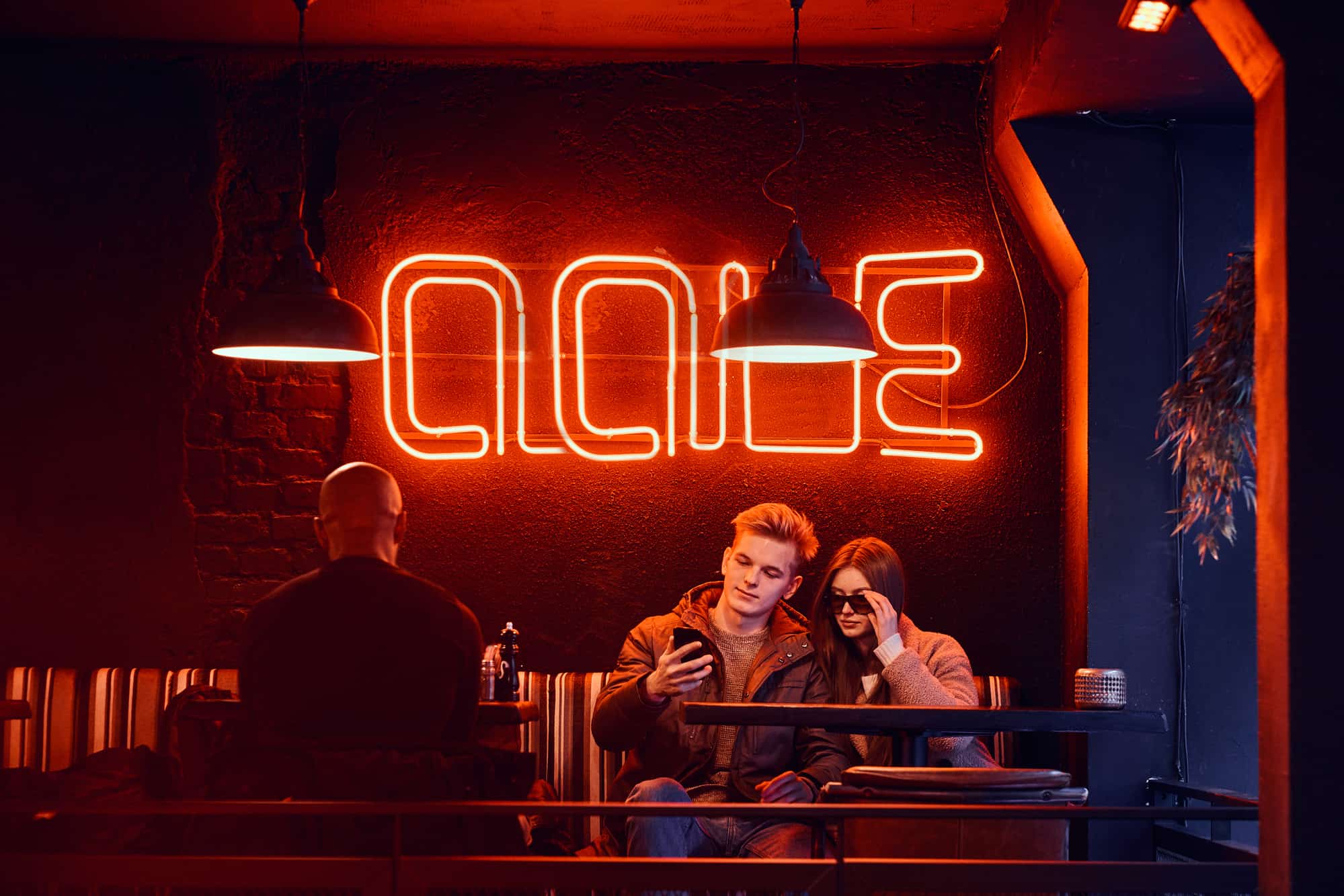
How to choose the best fonts for your design
Design is a powerful tool for building your brand image and appealing to a wide audience. Fonts are an integral part of any design project, whether it is a website, an ad banner, or graphics for social media. That is why the choice of fonts is so crucial to your work as a designer. Below are some essential tips on choosing fonts that might be useful for beginner designers.Remember about the aims of your design project
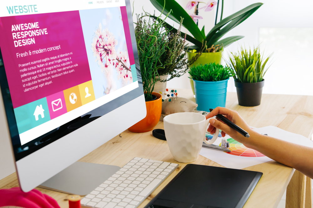
You should always choose the fonts according to your design needs and goals. Even the ‘craziest’, most unconventional and artistic fonts can work really well if they match your website identity or brand image. You need to be sensible and know exactly what you need to communicate with your design. For example, no one would use Comic Sans for a serious business card or a website or any project for that matter. If you choose the right style of the typeface, you can add another layer to the central message of your design project. Apart from the overall goals and aims of your design, you should also have a specific goal in mind for each font you use (such as ‘this bright and bold one is for headings, and that, more moderate one, is for the body text’).Don’t use too many fonts at the same time
Of course, you don’t have to stick to just one font. Sometimes designing with just one font might even look boring or on the contrary, its variation can add some sophistication to a project. However, you should always stick to a limited number of fonts. The more fonts you use, the harder it is to achieve visual harmony so that the fonts complement each other. Using just the right amount of typefaces is an art, not a science. It heavily depends on your design aims and goals, and sometimes the usage of quite a few fonts can be justified. Nevertheless, if you are not so sure how much you can add, try to stick to 2 or 3 fonts that work well combined. If you use creative fonts, you should try them out together and see if they don’t overshadow one another or clash aesthetically.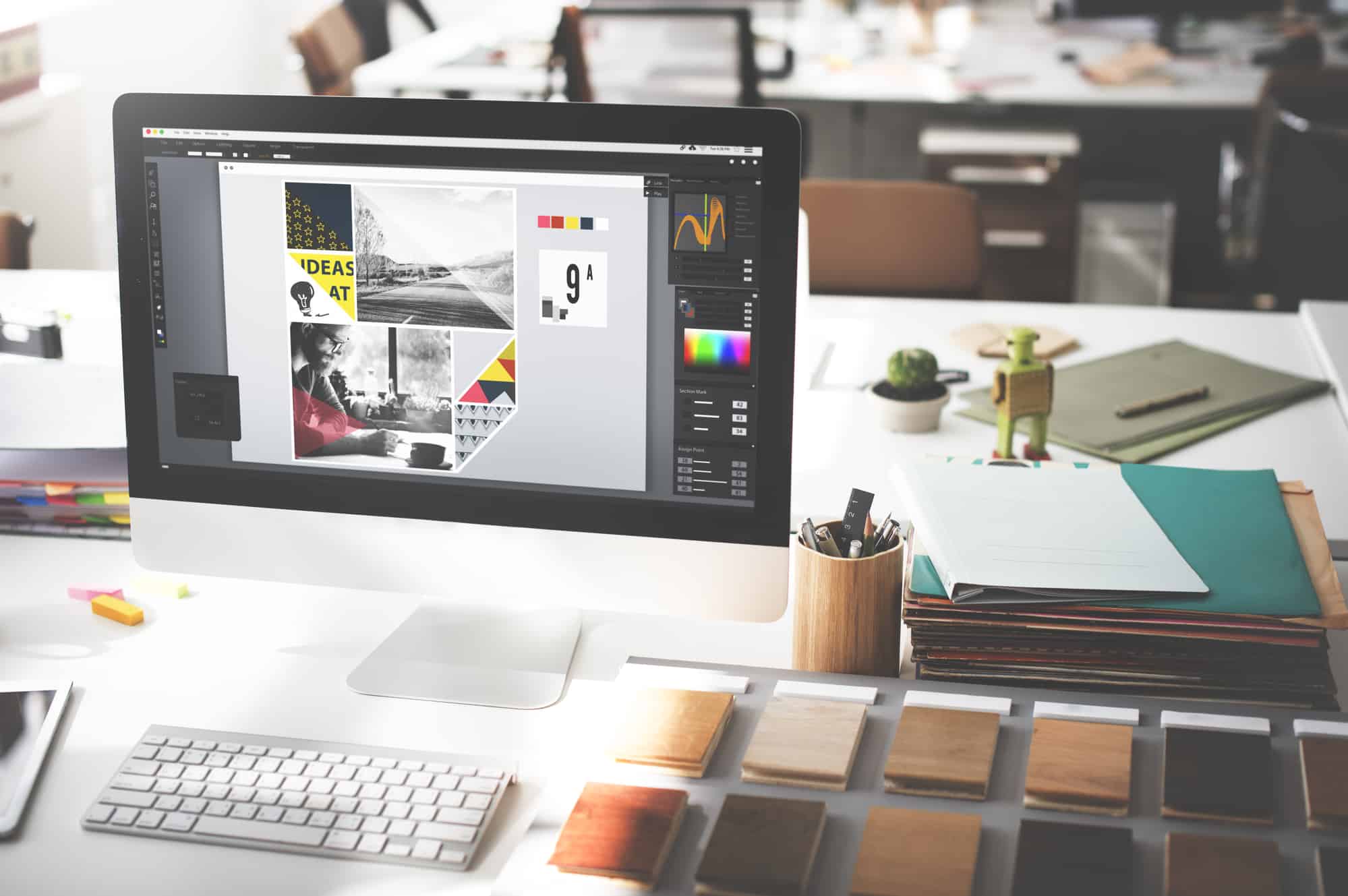
Make your fonts aligned and consistent
Concordance of fonts means they align with each other based on some similar traits they have. The safest and easiest option to make sure your fonts fit together is using fonts from the same typeface family or set. Many designers create a whole set of fonts, or several different styles of one typeface because they understand that very often you need several fonts, but want them to work together well. Another option is to use different fonts from the same designer. Typefaces from one author often have similar kerning (spacing between characters) and proportions, so you can try that out as well. Note that if the typefaces you use are too similar to each other, it would be hard to distinguish one font from another, meaning parts of your design won’t stand out as much as you intend.Create some contrast
Apart from concordance, you can create some quality contrast using the right fonts. It’s understandable that it’s harder for beginner designers to try to match the unmatchable, and they use similar fonts more often than contrasting ones. What’s more, not each design benefits from the heavy opposition of fonts. However, for some design projects, adding some contrast is a more appealing and interesting option than using typefaces from the same family. You can find an abundance of fonts that will look good together in your design projects. The simplest solution is to make contrast mixing serif and sans-serif fonts: for example, using a font with serifs for your headings or bigger lines of text and a non-serif font for the body text, or vice versa. You can also create contrast changing style, color, and form of typefaces.Contemporary and futuristic fonts (free or cheap) to make design appealing and memorable
There are tons of amazing paid typefaces out there you can select for your projects. However, you can find a variety of beautiful, contemporary-looking, and unconventional free fonts that will help your design stand out. Note that some of these typefaces are free for personal use and educational projects, but require a payment or a donation (usually not a big sum) if you want to use them for commercial purposes. You can find some typefaces for your projects on Google Fonts, where you can try out the same text in several fonts and download the ones you like for free. However, it contains the most common fonts, so if you want something more extravagant, you will have to do your research. Hopefully, this list of unconventional fonts will help you find inspiration for your projects and make them offbeat in a good way.1. Elianto
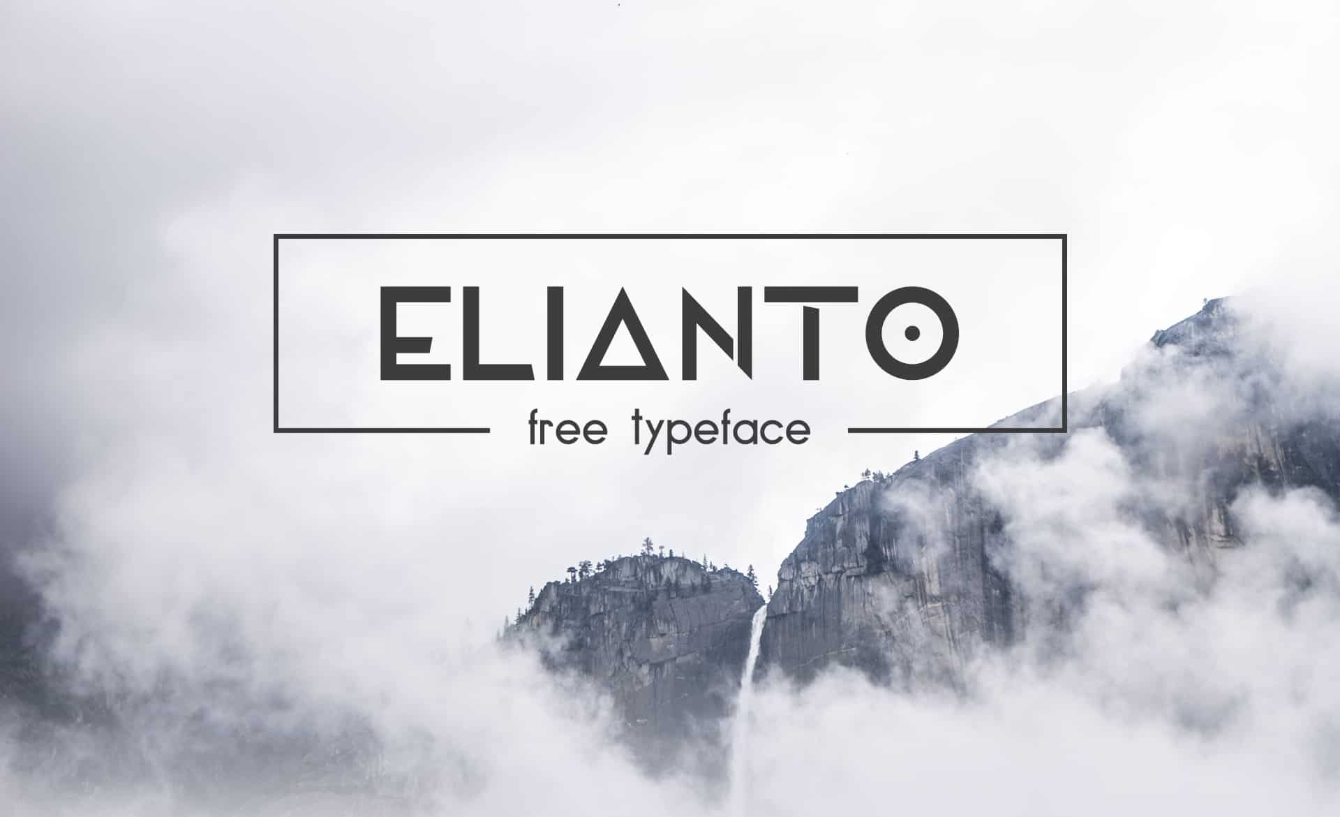 Elianto is a sans-serif typeface which contains uppercase and lowercase letters, several alternative letters, symbols, and glyphs. It was created by Amsterdam-based designer Emanuele Papale, and is available for free both for personal and commercial use.
2. Anurati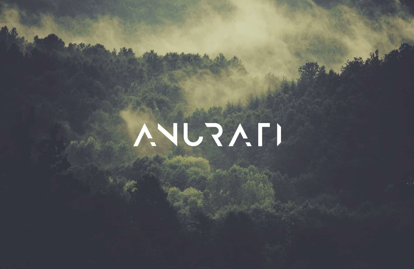
Anurati is a beautiful sci-fi font that is available for free for personal use only. If you want to use this uppercase font for commercial purposes, you can purchase Anurati Pro. The latter includes alternative glyphs and comes in two weights, regular and outline. You can also check out another futuristic-looking typeface from the same graphic designer, Emmeran Richard, called Blanka and available both for personal and commercial use free of charge.
3. Somatic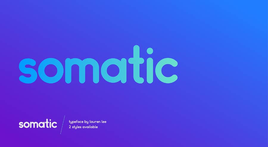
If you want less geometrical and more simple, yet nice font, check out the Somatic typeface. It is available in two styles – rounded and modular, free for personal use and cheap to buy for commercial projects. Somatic, created by NY-based illustrator Lauren Lee, looks simple, fun, and friendly.
4. Luciana
Luciana is a modern and dynamic all-caps typeface that includes letters, numbers, and symbols. Not only is it free, but also you can edit it yourself, as the font provides several alternative forms and stylings for letters, from more square to elegant and wavy. Luciana is a work by type designer Manh Nguyen, who also created several other beautiful free fonts. Check out delicate hairline sans-serif Arcadia, roundish and bright Fuerte, or geometric Atlantico.
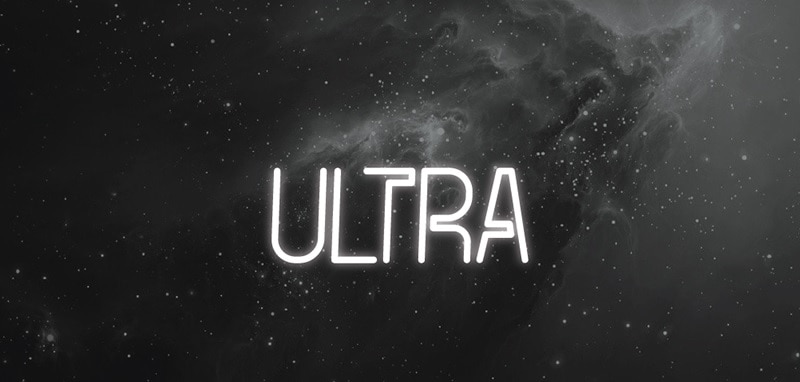
5. Ultra
6. Jaapokki
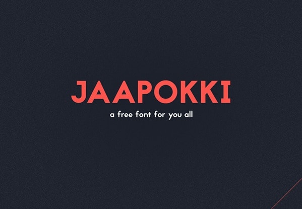 Jaapokki is a typeface that includes uppercase and lowercase letters, two sets of alternative versions for letters, numbers, and a wide range of glyphs and symbols for all your needs. It’s a classical, minimalistic and round font that looks very elegant and even hipsterish. With its fancy alternative letters, it will look amazing in book or podcast cover design, magazines, and on modern websites. The typeface, available for free personal and commercial use, was created by Finnish designer Mikko Nuuttila. He has several other free fonts that look awesome – check out his Behance.
7. Elixia
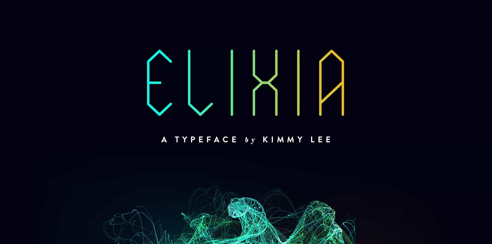 Elixia is a free geometric typeface which has both futuristic and mystical touch in it. Its creator Kimmy Lee used hexagon shapes and lines as her source of inspiration. It comes in both uppercase and lowercase letters and also includes numbers, extended characters, glyphs, and stylistic alternatives – more than 200 symbols in total.
8. HK Nova
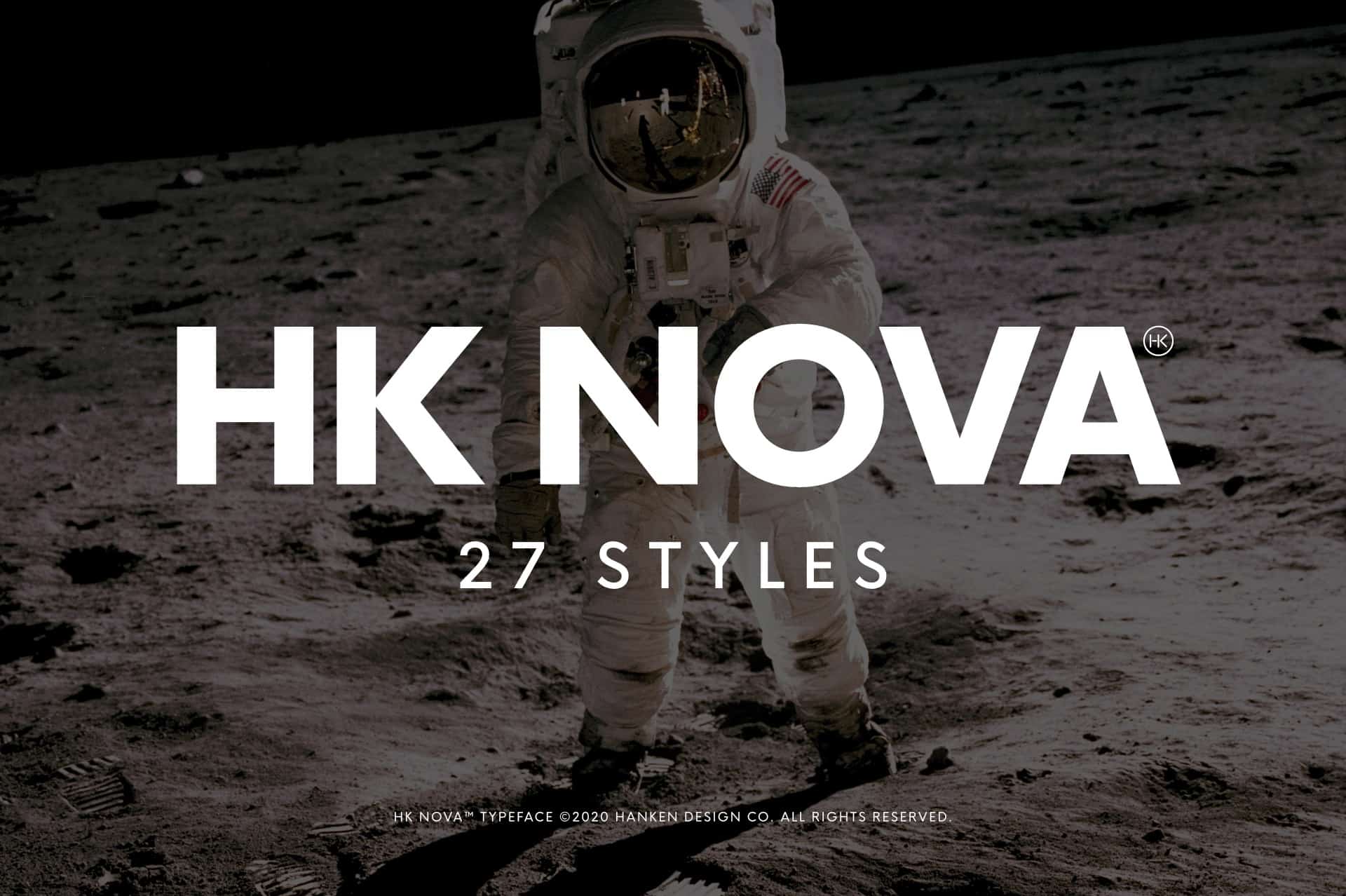 HK Nova is a sans-serif typeface that comes in 3 versions or families (standard, rounded, and narrow) and 27 different styles. It is quite a recognizable set of fonts since its minimalistic and roundish features appeal to many designers these days. Although it is not a free font (you can download the total pack of HK Nova families and styles for $45), the designer behind the typeface, Alfredo Marco Pradil, made available its limited version that you can use for free for your personal projects.
9. Strato
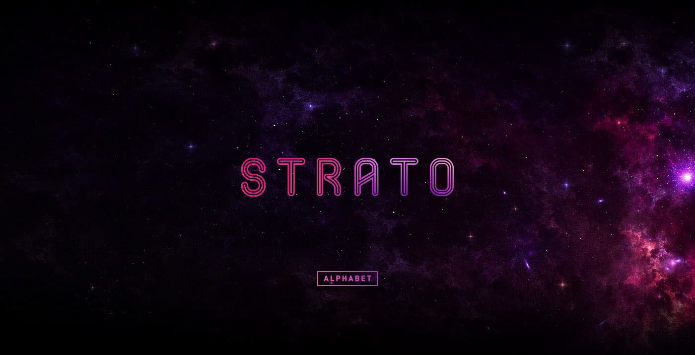 Strato is a geometric all-caps font that includes inline letters and numbers. The font was created by UX designer Pedro Pazmiño from Ecuador, who made this alphabet free both for personal and commercial use. Each character has a lot of space, which makes it look airy and futuristic.
10. Wormbox
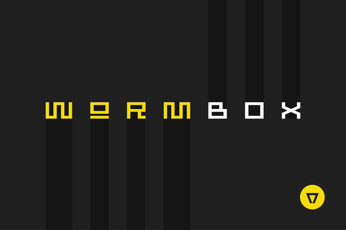 Wormbox is a font that looks like it was taken straight from an 80s video game. You can use it to create outstanding and unique titles. Although it’s not a free typeface, it is a cheap one as you can purchase it for less than $10.