Types of Contrasts in Photography
While this article is dedicated to color contrast, it’s important to explain other types of contrast. You don’t have to stick to one type in your images as they can be easily mixed with each other.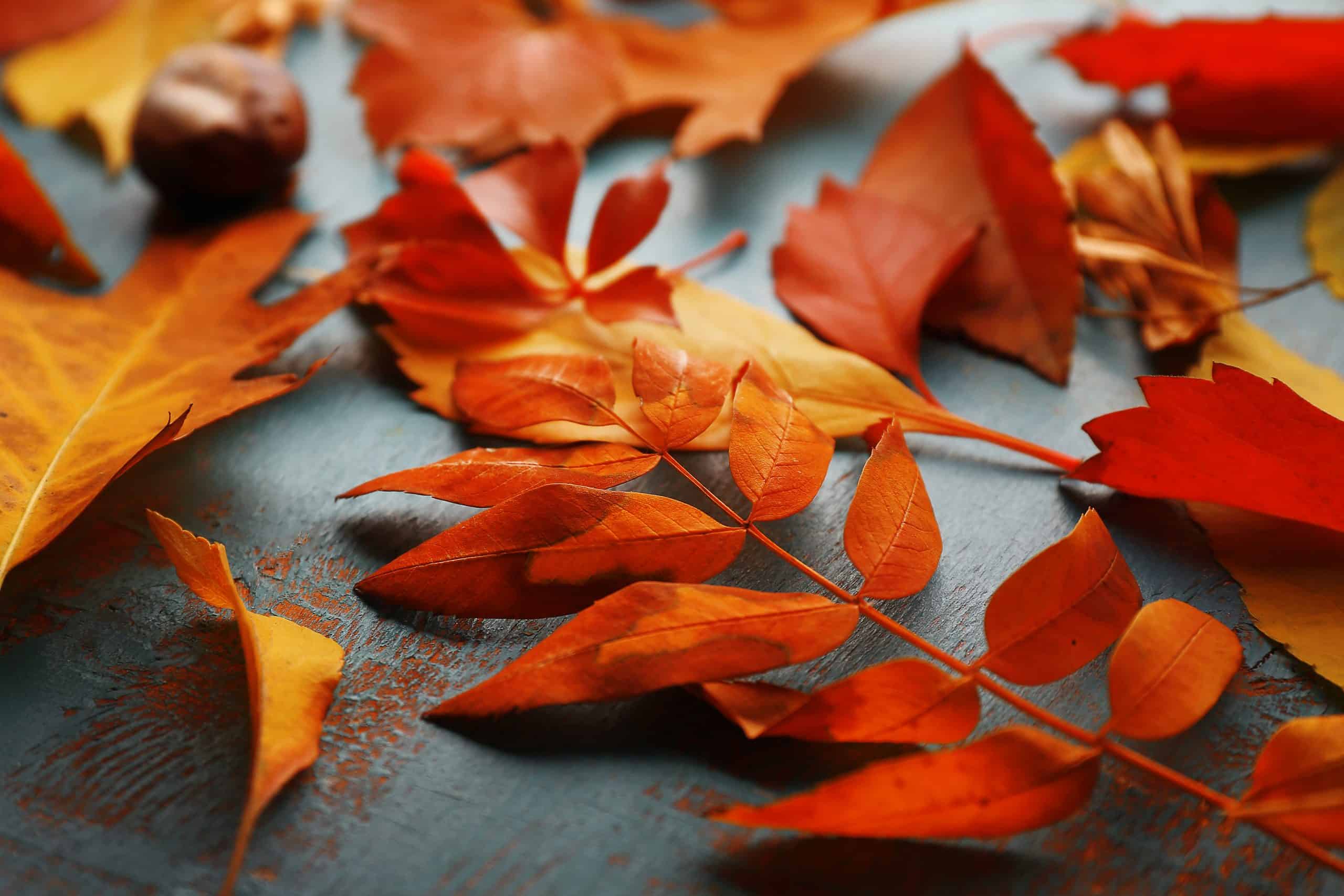
Tonal contrast
Tonal contrast is something that comes to mind when most of us think about contrast in general. This is what a person adjusts when they post an image on Instagram or edit photos in Lightroom. It is the contrast of the darkest and lightest tones in a picture, no matter what hues and colors there are. Some of the elements of your shot are darker, and some are brighter because there is a tonal contrast that creates the difference in brightness within different parts of your image. If you don’t want to rely on adjusting this contrast after you take a shot, set your camera in the black and white mode as this will help you better understand exposure.Color contrast
Color contrast is based on color compatibility. This type of contrast is about mixing different colors in a photo to create a dramatic visual effect or, oppositely, make an image softer with analogous, or relative colors. This is easily explored using modern Graphic Design Software featured on Spotsaas. Later in this article, we’ll explain how to combine colors for color contrast.
Texture contrast and background contrast
Texture contrast is a contrast in different textures within a frame. While you can combine different subjects and objects that have texture contrast (a hand and a piece of cloth, or a soft fruit on a wooden plate), the most obvious texture contrasts come with backgrounds. For example, if you shoot a soft and delicate flower in front of a brick wall, you capture a texture contrast. Another example is when you take a picture of a material subject or a person with a wide-open aperture and receive a shallow depth of field, resulting in a blurred background with bokeh. This is also a contrast – a concrete thing as your subject and a soft and delicate background.Conceptual contrast
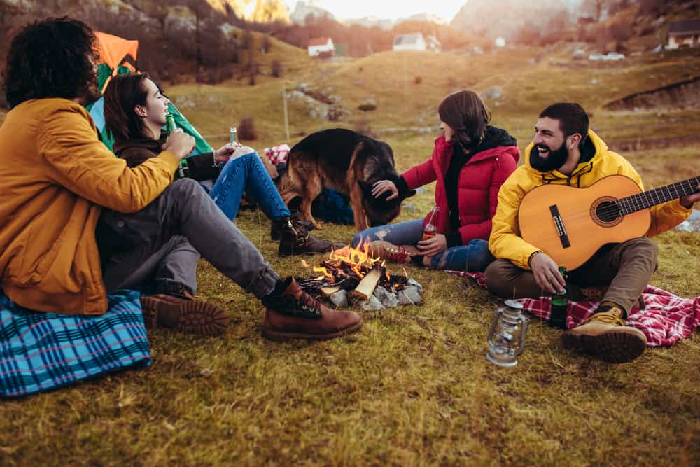
Conceptual contrast is when artists and photographers themselves put together some incompatible elements within a frame. This type of contrast is mostly about your artistic intentions and the message you try to communicate. To make it more clear, you’ve probably seen at least one of the works by street artist Banksy. He uses conceptual contrast a lot in his graffiti murals, mixing black and white images of children and adults with colorful subjects you don’t expect to see there (so you can say the artist uses both conceptual contrast and color contrast for extra visual emphasis). In photography, the same effect can be achieved in many photography genres, from still life to portraiture, as it depends on your imagination.How Color Contrast Works
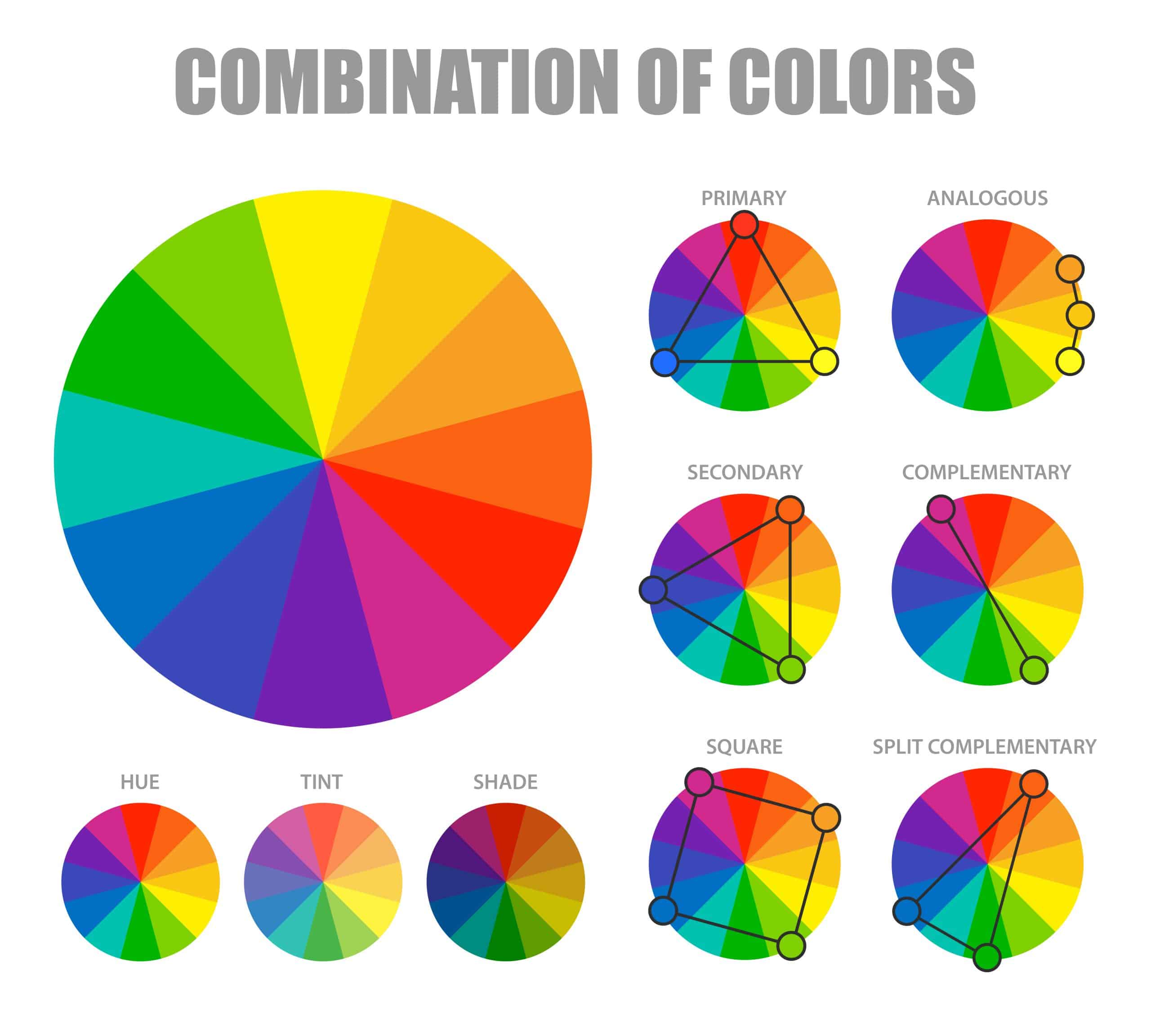 Color contrast in photography is based on the color wheel (take a look at the picture above). Understanding the color wheel will help you quickly find interesting color combinations for your shots, and it’s actually way easier than it seems.
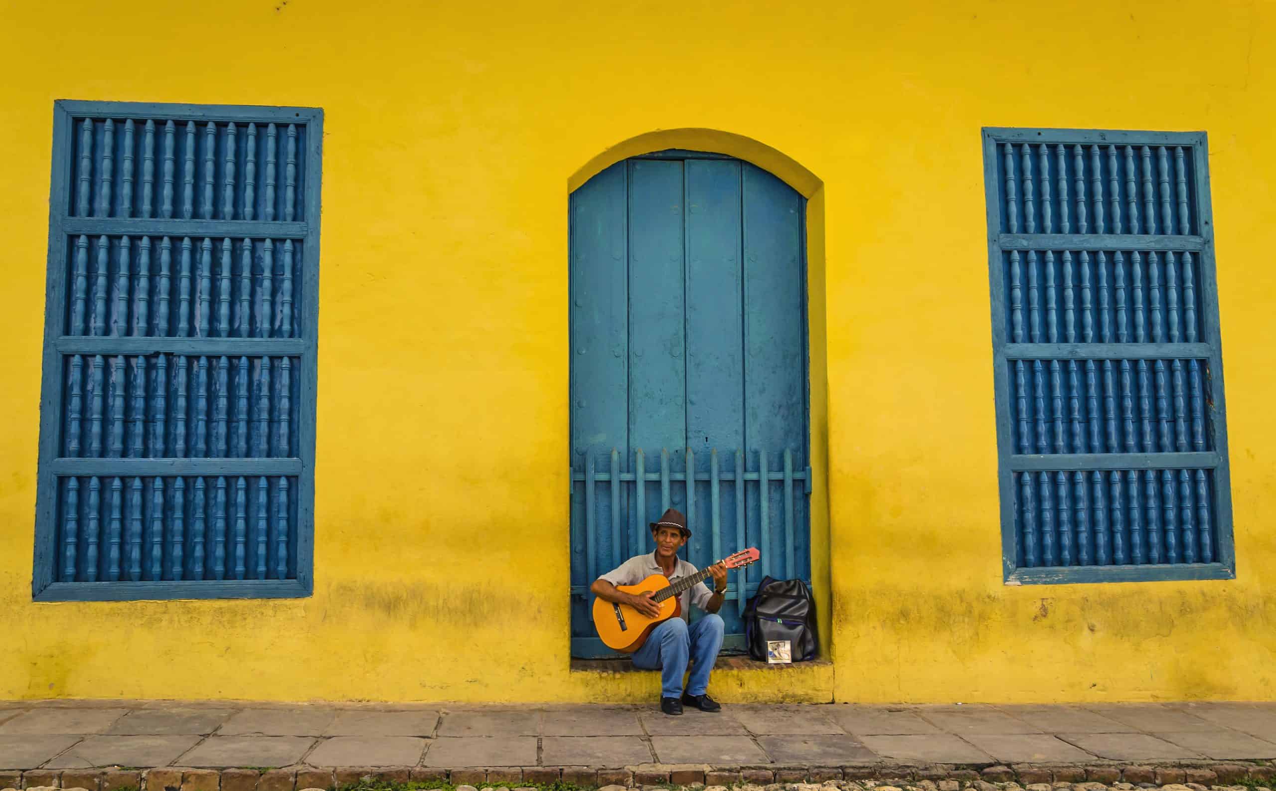
The most obvious and dramatic color contrast happens when you use complementary colors. These are the colors on opposite sides of the color wheel. Green and red are complementary colors, and the same goes for yellow and blue. It’s actually easy to memorize as green and blue are cold hues, and red and yellow are warm hues, so you need to combine a warm and a cold color for a strong contrast.
There are other color combinations you can find with the color wheel. Split complementary colors (or partly complementary colors) also create an interesting contrast. What’s more, you can use analogous colors and still receive an eye-catching photo as it also depends on other elements of your shot, such as shapes, forms, angles, and the composition itself.
Color contrast in photography is based on the color wheel (take a look at the picture above). Understanding the color wheel will help you quickly find interesting color combinations for your shots, and it’s actually way easier than it seems.
The most obvious and dramatic color contrast happens when you use complementary colors. These are the colors on opposite sides of the color wheel. Green and red are complementary colors, and the same goes for yellow and blue. It’s actually easy to memorize as green and blue are cold hues, and red and yellow are warm hues, so you need to combine a warm and a cold color for a strong contrast.
There are other color combinations you can find with the color wheel. Split complementary colors (or partly complementary colors) also create an interesting contrast. What’s more, you can use analogous colors and still receive an eye-catching photo as it also depends on other elements of your shot, such as shapes, forms, angles, and the composition itself.
Ideas for Color Contrast Photography
You don’t have to learn the color wheel by heart. It’s way better to try and search for interesting color combinations and schemes yourself so that you can understand color contrast with practice.Keep it simple
To start with color contrast, it’s a good idea to choose 2 or 3 colors and work with them instead of choosing more colors. More colors can be tricky in terms of achieving the desired contrast, so you need to keep it simple. Actually, the fewer colors you use, the more contrast you receive. For instance, think about several colorful buildings (like in Amsterdam). If you take a long shot of them, you will receive an image with a lot of bright details, but the overall contrast won’t be so dramatic. That’s why it’s better to isolate a colorful object on a contrasting background. In case of shooting a scene with a lot of bright details, opt for close-up shots to isolate fewer colors.
Understand contrast with still life
The easiest way to understand how colors contrast each other is to shoot still life using bright and bold colors. You can start with your own kitchen. If you have colorful plates, place the fruit on them, like a green apple on a red plate, or vise versa. Experiment with different backgrounds so that you can see with your own eyes which color combinations work best for you and your style. Once you understand this, you can move on to adding more elements to your still life photos and using analogous colors within your objects.Search for contrast in nature
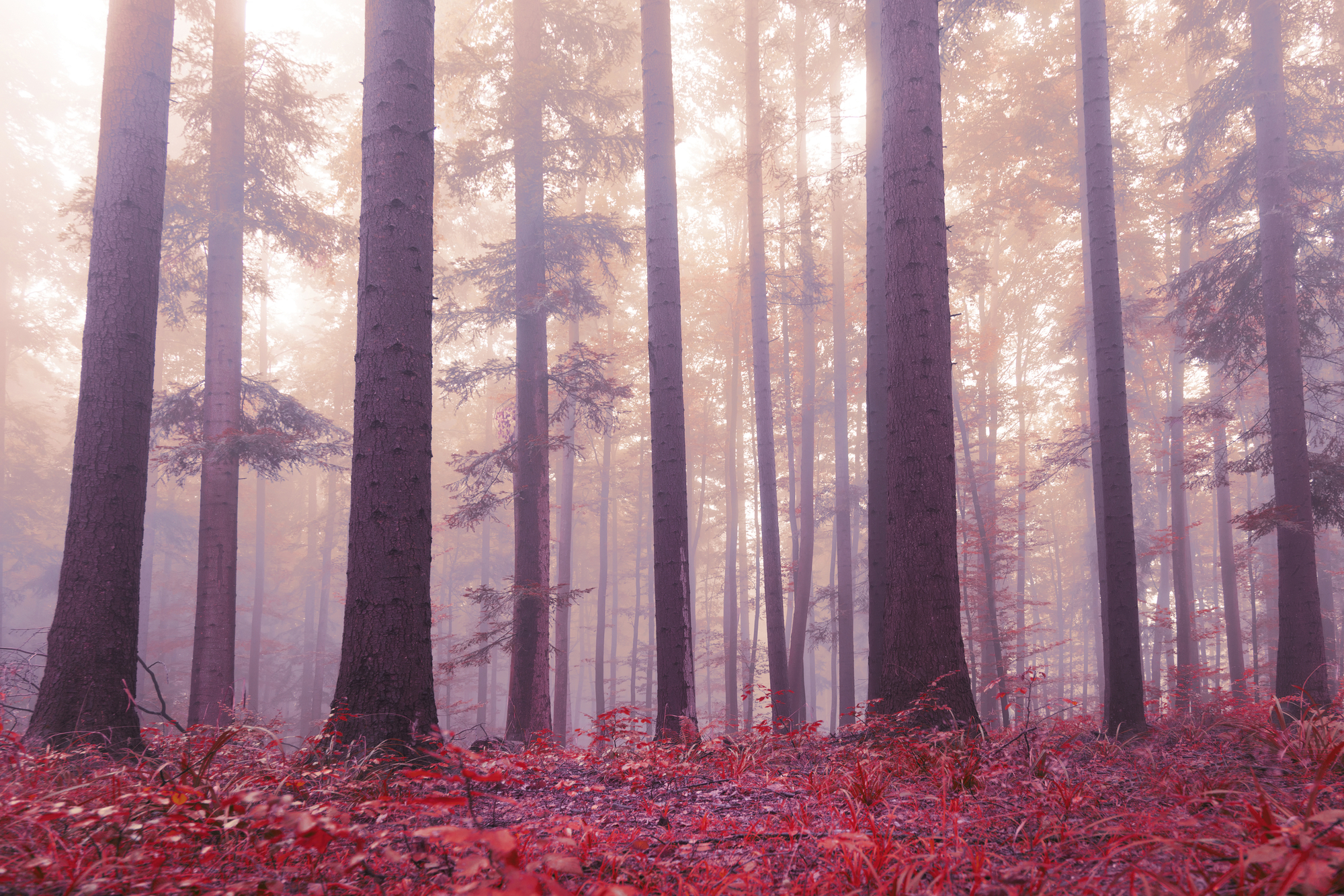
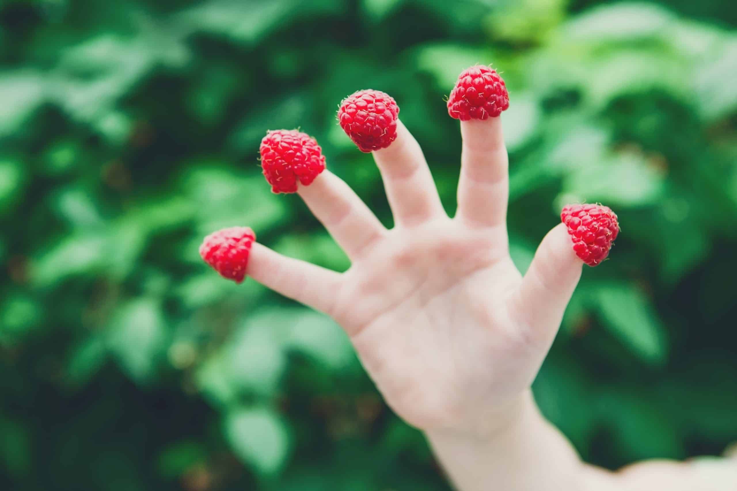
Nature has a lot of contrast. Green grass can serve as an amazing background for red, orange, and yellow insects – think about a ladybug on a grass blade. Flowers also contrast with greenery, and if you are lucky enough to capture a bird, you will also get an intriguing color contrast. Pay attention to natural color contrast next time you walk around a forest or a park with your camera.