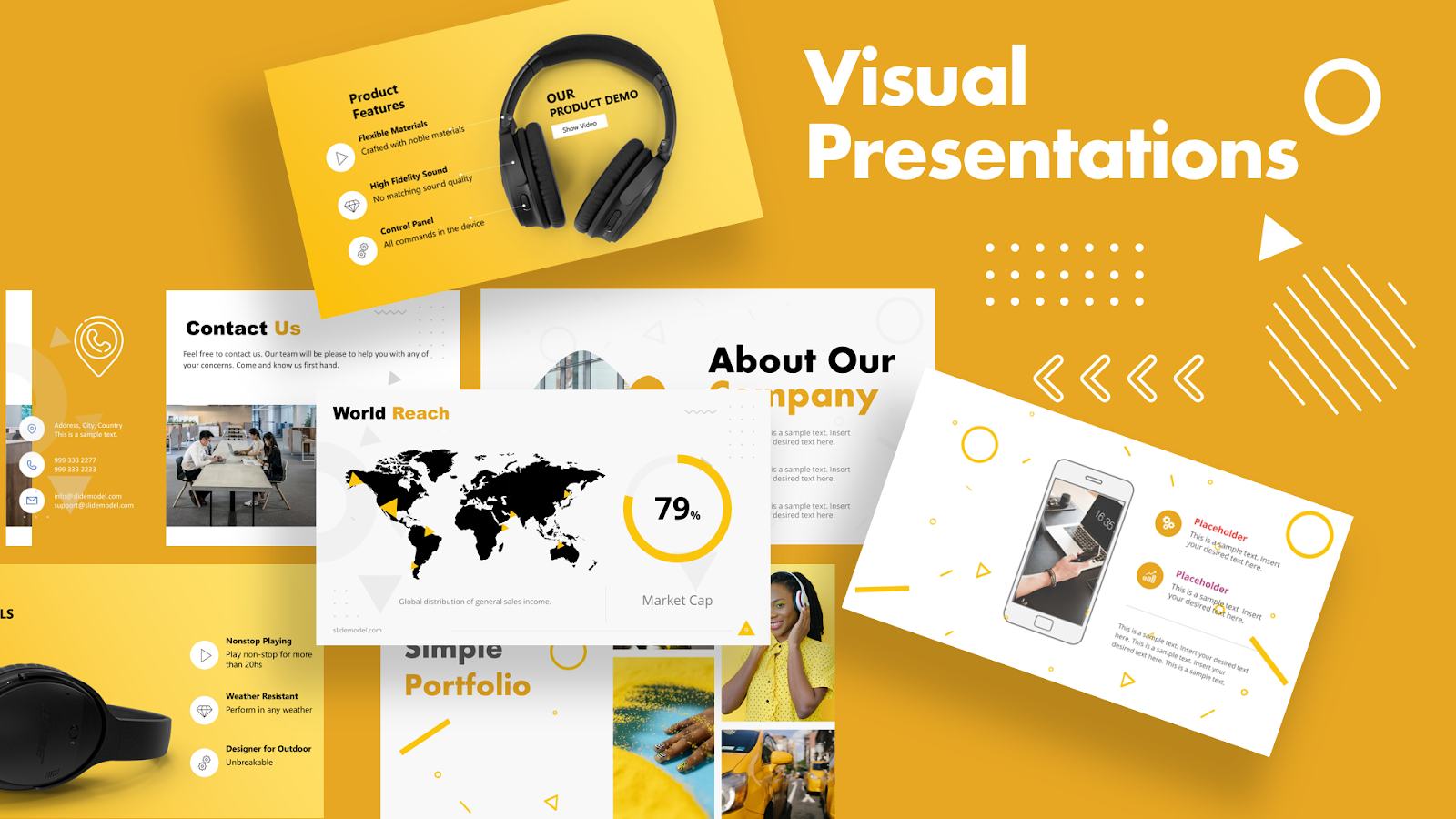
 Some presenters undervalue visual presentation and opt to speak or rely on text slides to support their points solely. That is where they might go wrong, because good visual presentations can have a major impact on your audience.
Hence, emphasizing the use of visuals for effective presentation making is essential. It doesn’t matter if the presentation is scientific, academic, or educational.

Visual presentation idea by SlideModel.com
Why are presentation visuals important?
It’s important to utilize visuals in presentations because they convey messages more efficiently and make them memorable. Most of us are visual learners, which is why infographics and other visuals aid in effectively communicating a message to an audience. An effective presentation is the one that raises the following probabilities:- Keep your audience engaged during the presentation.
- Make your audience understand the message you are conveying as a presenter.
- Memorize the presentation for a long time.
What is a good data visualization?
Good data visualization delivers information to viewers using colloquial expressions that they comprehend, frequently through images, infographics, or charts. Good data visualizations contain reliable data, a wise choice of visualization, clear information and color choice, as well as a consistent scale that appropriately represents data.
Example of visual slides from MacWorld SF 2018 (left) and engaging presentation slide (right)
While utilizing multiple colors speeds up data visualizations, employing too many can be confusing. It’s critical to select a small selection of colors that are distinguishable from one another. Hence, consider limiting the use of multiple colors to at least five different hues. On the other hand, using different sizes of visuals will make information easier to comprehend. To achieve this, consider using PowerPoint templates for clear and effective visuals. For instance, you can use one large circle and one small circle to show a comparison between two scenarios. However, don’t overdo anything. Stick to one or two sizes so that the viewers can easily distinguish them. Remember, one of the key goals of data visualization is to make information easier to comprehend. Therefore, insights cannot be gleaned by putting together a few charts; you have to engage the reader by demonstrating why they should care or take action in response to it. Data visualization is a powerful tool that can benefit both discrete and continuous data by facilitating understanding, communication, decision-making, and identification of insights and patterns in the data.What is bad data visualization?
 Bad data visualizations can leave you with incorrect assumptions that hurt your organization. They typically have faulty data, bad visualization, too much color or information, data misrepresentation, and inconsistent scales. As a result, visuals appear too cluttered for anyone to understand. These are some of the most prevalent bad data visualization mistakes, and many people are guilty of them.

Benefits of adding strong visuals in your presentation:
We all know that actions speak louder than words, but do you know what else does? The use of images, and there’s a solid reason for it.According to the Massachusetts Institute of Technology researchers, “Our brains naturally process images faster, with a full image requiring only 13 milliseconds to process”.
As a result, it’s no surprise that images have been shown to boost user engagement by up to 94 percent. If you hold team meetings or brainstorming sessions, it’s time to start including photos in your audience engagement efforts. For the skeptics among you, we discuss why including solid images in your presentations can benefit your audience greatly.1. Visual aids clarify your message:
Words alone can often make it challenging to communicate your message to an audience. You must have heard this phrase before: “A picture is worth a thousand words”. Experience it yourself by adding visuals to your PowerPoint Presentations. You’ll avoid the possibility of miscommunication by including appropriate supporting visuals in your slide templates or live polls. This is especially critical if you are debating and voting on a major choice that requires everyone to remain on the same page. Below, we discuss three ways to use visuals for brainstorming and decision-making:
- Meetings for brainstorming:
- Making design decisions:
- Choosing a theme for the event:

2. Relevant illustrations help the audience remember what they’ve learned:
The very first step to engaging with your audience includes capturing their attention. However, with so many distractions around, this is becoming increasingly challenging. But nothing is impossible; adding figures or graphics is a terrific technique to grab the attention of your audience before presenting essential points.
Action Changes Things written by hand on whiteboard
3. Images serve to break up the monotony of text:
Suppose you don’t utilize audience engagement visuals in your PowerPoint presentations. In this case, you will fail to persuade your audience. Long events can be dull and tiring, which means your audience might easily lose interest. In this case, incorporating engaging visual content can help you get through sessions effectively. Doing so will boost viewer interest and help focus on what you have to say. Moreover, having a quick feedback session in between would charge your audience. Even if you incorporate polls to collect your audience’s valuable feedback and promote engagement, add infographics in your presentation slides to break the monotony of the text. This way, you’ll keep things interesting and engaging from beginning to end.
4. Cute and amusing images make your breakers more interesting:
If your presentation is going smooth, but is a lengthy one, then your audience definitely needs a break. It is on you to identify when to break the ice before losing attention. Try using fun polls with appealing or humorous visual content, instead of starting with serious questions or diving right into your PowerPoint presentation. For example, create a trivia game, vote on unusual cuisine pairings, or simply show your audience your favorite kitty image. You’d be shocked with what a difference it can make to their energy levels, as well as yours!
5. Powerful visuals can evoke emotion:
Remember, the key to enthralling your audience is to build an emotional connection with them. Even if you don’t know much about the subject, try to make them feel an emotional connection about what you are talking about. When you elicit an emotional response from your audience, you can keep their interest and attention for a prolonged period, and your involvement will have greater impact. Images are a quick way to establish an emotional connection since humans are first and foremost visual creatures. As per a survey, visual information accounts for over 90% of the information conveyed to our brain. As a result, we are able to connect with visuals on a much deeper level.
Second, visuals can communicate more information than words alone. Research of PNAS shows that almost all information transferred to the brain is visual. People are said to remember visuals better than just words. This is due to the fact that visuals can successfully express complicated and abstract ideas such as emotion and color to an audience. These extra indications can elicit a stronger response from an audience, making their participation more enjoyable for both them and you.
6. Visuals encourage audience participation
Involving an audience can be quite a challenge, particularly if you are presenting a multinational event, or need to customize your PowerPoint presentations to a culturally or linguistically varied audience.
Add photos to the process of making icebreakers and opinion surveys more accessible. Images have a worldwide appeal. Unlike witty punchlines or smart jokes, recognizing an image takes little background or language knowledge. Consequently, regardless of any language difficulties, your programs will attract a bigger audience and build an effective connection.
7. Images simplify messages
Have you ever witnessed your audience staring at you blankly? If yes, then you really need to work on your PowerPoint presentations. It is possible that dense and intricate messaging will be your downfall. We all have to communicate tough concepts timely, but the key to doing so effectively is by breaking down information into manageable chunks.
Moreover, you can also include some good visual content for infographics, as you may have predicted. Including visual content in your presentation slides, such as word clouds, flow charts, or related images can assist in simplifying your content and maintaining your audience’s attention.


